ShopDreamUp AI ArtDreamUp
Deviation Actions


Description
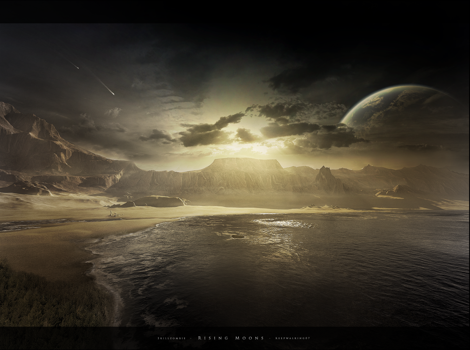
A piece me and  made a few weeks ago. Originally it was going to be submitted for a pack, but since the pack was never going to see the light of day, we figured what the hell and submitted it.
Terragen Landscape:
Everything else that makes it worth seeing:
Update: Reflection and minor issues fixed.
made a few weeks ago. Originally it was going to be submitted for a pack, but since the pack was never going to see the light of day, we figured what the hell and submitted it.Terragen Landscape:
Everything else that makes it worth seeing:
Update: Reflection and minor issues fixed.
Image size
1593x1185px 2.57 MB
© 2010 - 2024 SkillZombie
Comments93
Join the community to add your comment. Already a deviant? Log In
What I love most of all about this image is definitely the terrain. It is crisp and incredibly detailed with gorgeous water and a great landscape design.
What I also really like is the atmosphere and the coloring. The contrast is beautiful and complements the scenery very well. However, in certain areas the applied postwork is rather obvious:
- although the sky is actually cloudy and the lighting dull, the water doesn't reflect the sky properly as it shows a really bright sun reflection and no sign of clouds or a planet. Also, with the new lighting the clouds at the far right don't match anymore
- I am missing long shadows where the station is
- according to the position of the planet towards the sun and the lighting on the terrain, I'd say the lighting on the planet should be a little bit sharper and more precise. Additionally, the clouds on top of the planet appear kinda cutout. I would have chosen a softer brush to blend them with the planet
- what bothers me the most is the forest at the bottom, it blends really badly with the coast and the sand and also the perspective seems wrong to me. Apart from that it lacks the sharpness the rest of the image shows; the transitions are blurry and kinda sloppy. The treetops should be lit rather sharply. The forest doesn't really add anything to the composition of the image after all, so I'd suggest simply to remove it
- the landscape appears to be oversharpened slightly; it would be great if both, photos/painting and 3D elements show equal levels of sharpness
Despite of all the critique it is still a fantastic image absolutely deserving the fave. Great collab guys.